
The Shiller PE Today: What Cyclically Adjusted Valuation Says Now
August 28, 2026
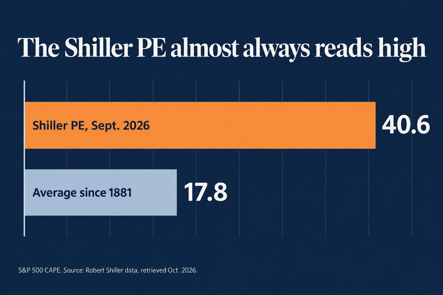
The Shiller PE has read expensive for most of thirty years. Most of that comes from what’s inside its earnings rather than from price. So read it as slow-moving context, and put a multiple built on Uniform earnings beside it before you draw a conclusion.
That matters when a client note has to survive both a skeptical client and a compliance review. A high reading can come from a depressed, distorted denominator rather than a price run-up. The sections below show where the reading comes from, how to check it, and what to say about it.
Key points
- The Shiller PE divides the index by ten years of inflation-adjusted, as-reported earnings.
- CAPE reads high mostly from its denominator, which accounting distortions and weak years shrink.
- Valens put the market’s Uniform P/E at 20.4x in August 2026, down from 23.1x at the end of 2025.
- Expect a narrower gap to Uniform P/E where financials or commodity producers dominate.
What Is the Shiller PE Ratio?
The Shiller PE divides today’s price by ten years of earnings. Specifically, it’s the index level divided by the average of the past ten years of inflation-adjusted, as-reported earnings. It’s also called CAPE, for cyclically adjusted price-to-earnings.
Robert Shiller built it to solve one problem. A single year of earnings can be at a peak or a trough. Dividing by a ten-year average smooths that out. That’s what it’s good at, and it’s a real strength. A one-year P/E that looks normal coming out of a recession can hide the fact that the earnings base is unusually depressed.
That said, the Shiller PE is a long-horizon context reading. Using it to call a turn asks a smoothing tool to do forecasting work it wasn’t built for.
Why the Shiller PE Almost Always Reads High
A high CAPE print often lands with clients as a sell signal. It usually isn’t the price doing the work.
The first reason is the accounting. CAPE averages ten years of as-reported earnings, and it never fixes what’s inside them. Goodwill write-offs, expensed R&D, lease distortions, and “one-time” charges that repeat all flow straight into the denominator. Averaging a decade of distorted earnings doesn’t clean them up. It just smooths them. Our guide to earnings quality walks through the biggest distortions one by one.
The second reason is the window itself. When the ten-year lookback includes a shock year or two, the average stays low long after profits recover. The trailing P/E can look ordinary while the Shiller PE stays in the thirties, and it can stay there for years.
The third reason is index mix. The index has shifted toward businesses that invest through the income statement: software, R&D, and brand spending that gets expensed rather than capitalized. Their reported earnings understate their earning power, so the aggregate denominator is understated too. Jeremy Siegel made a version of this argument in the Financial Analysts Journal. Changes in how GAAP earnings are computed, he found, have made CAPE-based forecasts more pessimistic than they should be. Our Knowledge Base page on why GAAP earnings distort profitability covers the mechanics.
So before CAPE goes into a client memo, ask one question. Is the high reading coming from price, or from a decade of depressed and distorted earnings?
Example: 24x, 33x, 20x
The same index can look expensive and reasonable at the same time. The numbers below are illustrative and don’t describe a real index.
Take an index priced at 2,400 per unit. Trailing as-reported earnings are 100 per unit, so the trailing P/E is 24x. The ten-year average of inflation-adjusted as-reported earnings is 73, because two weak years are inside the window, so the Shiller PE is 33x.
Now restate the earnings. Uniform Accounting is a set of more than 130 adjustments that put every company’s financial statements on one comparable basis. Capitalize the expensed R&D and software investment, remove the goodwill write-offs and the repeated one-time charges, and restate lease expense. Current earnings come out at 120 per unit. The Uniform P/E is 20x.
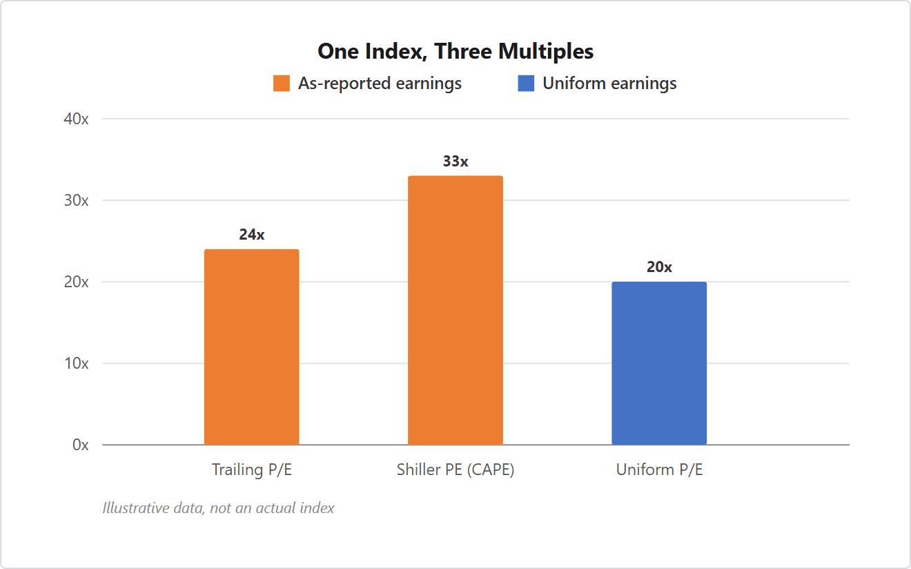
The price didn’t change between the three bars. The denominator did. From 24x to 33x is the averaging window. From 24x to 20x is the accounting.
The five-year view shows why the two effects stack. As-reported earnings per unit run 82, 68, 95, 100, 100. Uniform earnings run 104, 108, 112, 118, 120. The two weak as-reported years pull the ten-year average down, and the expensed investment keeps every year’s reported figure below the adjusted one.
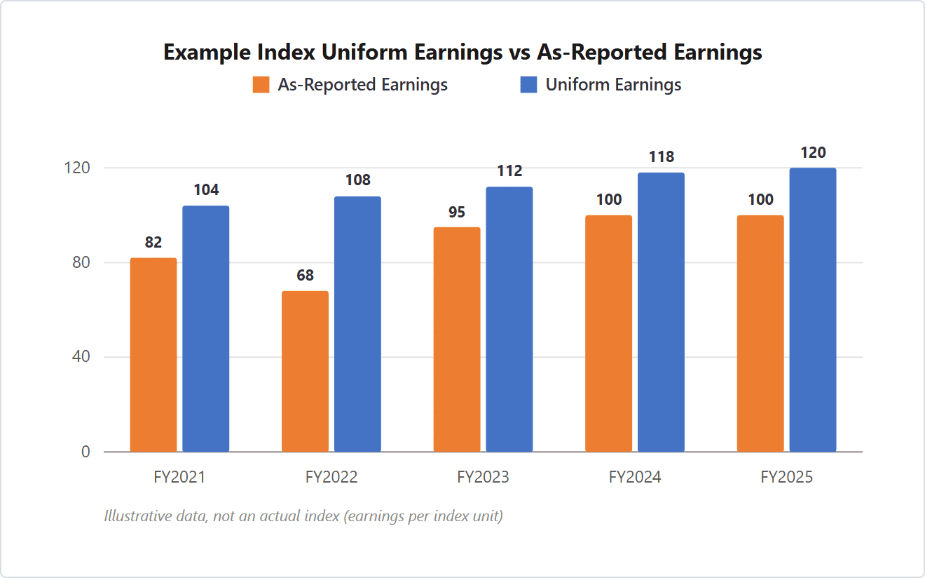
When CAPE looks stretched in a deck, ask whether price moved or the earnings base stayed low. In this example, the earnings base did all the work.
How to Read CAPE Beside Uniform P/E
Each multiple divides by a different thing. Knowing what each one fixes and misses keeps the memo defensible.
| Multiple | Divides price by | What it fixes | What it misses |
|---|---|---|---|
| Trailing P/E | The last twelve months of as-reported earnings | Uses the most current earnings | Cyclical peaks and troughs, and the accounting inside the earnings |
| Shiller PE (CAPE) | A ten-year average of inflation-adjusted as-reported earnings | Smooths the earnings cycle | The accounting inside the earnings; weak years depress the average for a decade |
| Forward P/E | The next twelve months of forecast earnings | Reflects expected near-term changes | Forecast error, and the same accounting problem |
| Uniform P/E | Uniform earnings, restated under Uniform Accounting | Removes the accounting distortions | Macro and cycle risk; still not a timing tool |
When they diverge, don’t split the difference. CAPE is the slow context check. Uniform P/E translates today’s price into what the market requires from underlying earnings, which is the question a client can follow.
Valens Research’s Market Phase Cycle framework shows how small that valuation input is. Valuation carries a 5% weight; credit carries 55% and earnings growth 30%. As of August 2026, Valens put the market’s Uniform P/E at 20.4x, down from 23.1x at the end of 2025. Earnings growth was forecast in the mid-twenties for 2026 and 2027. A multiple in the mid-twenties would normally go with growth like that, per the Valens Market Phase Cycle Monitor for that month. In other words, a market that reads expensive on ten-year as-reported earnings can read reasonably priced on Uniform earnings and current growth.
The monthly Uniform P/E and the full Market Phase Cycle reading are published in FA Alpha Pulse. A high Shiller PE is one input to that reading, and a small one. A sentiment check, like the one in our page on whether investor sentiment is too bullish, does more to explain a short-term pullback than CAPE does.
What to Say to Clients
When clients see the CAPE chart in the news, they can wear your phone out with anxious calls. These lines soothe their fears without dismissing them.
“The Shiller PE has said the market is expensive since the early 1990s. It’s context rather than a signal.”
“That ratio divides price by ten years of reported earnings. Two bad years inside that window keep it high long after profits recover.”
“On earnings with the accounting distortions removed, the market’s multiple is a lot lower than the headline number. That’s the figure I build your plan around.”
Where the Shiller PE Is Less Useful
The argument above is weaker in some markets. In an index dominated by financials or commodity producers, Uniform adjustments are smaller and the cycle really is the story. There, CAPE’s smoothing is doing useful work and the gap to Uniform P/E is narrower.
The reverse case matters too. When the ten-year window contains a genuine earnings collapse, like 2008 to 2009, the trough can mechanically hold CAPE up for years. In those stretches, the reading says more about what’s inside the window than about what the market should do next. The same caution applies to any single multiple, which is why our stock analysis starts from cleaned-up numbers rather than a ratio.
Key takeaways
- The Shiller PE smooths the earnings cycle but still divides by ten years of as-reported earnings.
- It reads high mostly because of the denominator: accounting distortions, weak years inside the window, and an index that expenses its investment.
- Put Uniform P/E beside CAPE to translate today’s price into what underlying earnings have to deliver.
- A high CAPE print is context rather than a timing trigger; in the Market Phase Cycle framework, valuation is 5% of the read.
Frequently Asked Questions
What is a good Shiller PE ratio?
There isn’t a single good level that works across eras. The Shiller PE is a relative check against its own history rather than a pass-fail threshold. For a client-safe framing, talk about what a higher reading has meant for long-horizon returns rather than what happens next quarter.
Is the Shiller PE a reliable indicator?
It’s reliable as a slow measure of price against a long earnings baseline, and unreliable as a timing tool. CAPE can stay elevated for years while prices keep rising, because the denominator stays depressed. Pair it with a multiple on Uniform earnings, such as Uniform P/E, before drawing conclusions.
Why is the Shiller PE so high?
Most of the time the high print comes from the earnings in the denominator rather than from price. CAPE averages ten years of as-reported earnings, which carry goodwill write-offs, expensed investment, and repeated one-time charges. The window can also hold unusually weak years, which keeps the average low after profits recover.
What is the difference between the Shiller PE and the regular P/E?
A regular trailing P/E divides price by the most recent year of as-reported earnings, so it swings with the cycle. The Shiller PE divides by a ten-year average of inflation-adjusted as-reported earnings, so it smooths the peaks and troughs. Neither one fixes the accounting inside the earnings, which is why Uniform P/E often shows a different picture.
When is the Shiller PE less useful?
In markets dominated by financials or commodity producers, where the cycle matters more and Uniform adjustments are smaller. It’s also less useful when the ten-year window contains a genuine earnings collapse. That trough can hold CAPE up for years regardless of what the market does next.
See the Uniform view applied every morning
FA Alpha Daily applies this to one company, metric, or market signal every morning, free for financial advisors.
Get FA Alpha Daily